A Look at the Iconic SPAR Logo over 90 Years
11 May 2022
As SPAR International marks the 90th anniversary of the SPAR Brand this year, we take a look at the SPAR logo, used across the SPAR network and recognised by shoppers around the world.
Across our vast global network, SPAR stores, trucks, uniforms, and packaging have become instantly recognisable, with the single most important factor in this recognition being the striking and unique SPAR logotype.
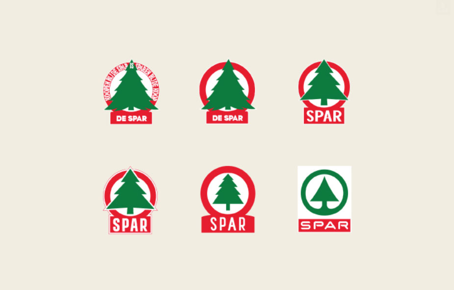
The SPAR logo has evolved since the organisation’s founding in 1932. However, the main element of a stylised fir tree has been part of the SPAR Brand since the company’s inception. The use of this symbol can be traced back to SPAR’s original name, DESPAR.
As an acronym of a slogan created by SPAR’s founder, Adriaan van Well, DESPAR aptly describes the organisation: Door Eendrachtig Samenwerken Profiteren Allen Regelmatig, which translates into English as ‘All regularly benefit from joint co-operation’. In Dutch, De Spar means fir tree, making the tree symbol a perfect fit to identify the organisation.
The organisation’s name changed from DESPAR to SPAR in the late forties of the 20th century, and over the years, the fir tree logotype was adapted several times as the organisation grew and flourished.
In 1968, the SPAR logo was redesigned by renowned designer Raymond Loewy. This iconic design has remained unchanged ever since, with the stylised fir tree and distinctive typeface becoming globally recognised.
The SPAR logo is the single most crucial factor in building brand recognition, supporting the development of SPAR as a world-class brand and signalling the values of the SPAR Brand to customers. Wherever customers see the SPAR logo, they can expect the high-quality products and services with which SPAR has long been associated.